🛠️ Setting up District Engage
District Engage offers extensive customisation options to help you create a unique and engaging community platform that reflects your organisation’s brand and design preferences. This comprehensive guide covers all available styling configurations, from basic appearance settings to advanced customisation options.
Accessing Settings
To configure your site’s styling options:
- Log into your District Engage admin dashboard
- Navigate to Settings in the left-hand menu
- Select the appropriate section:
- Appearance for frontend styling options
- Home page for homepage-specific configurations, which can effect the look and feel of your site.
Administrator Access Required
Appearance and styling settings require Admin permissions. These changes affect your entire site, so proceed with caution and consider testing changes on a staging environment first.
Frontend Styling
Access general styling options through Settings > Appearance.
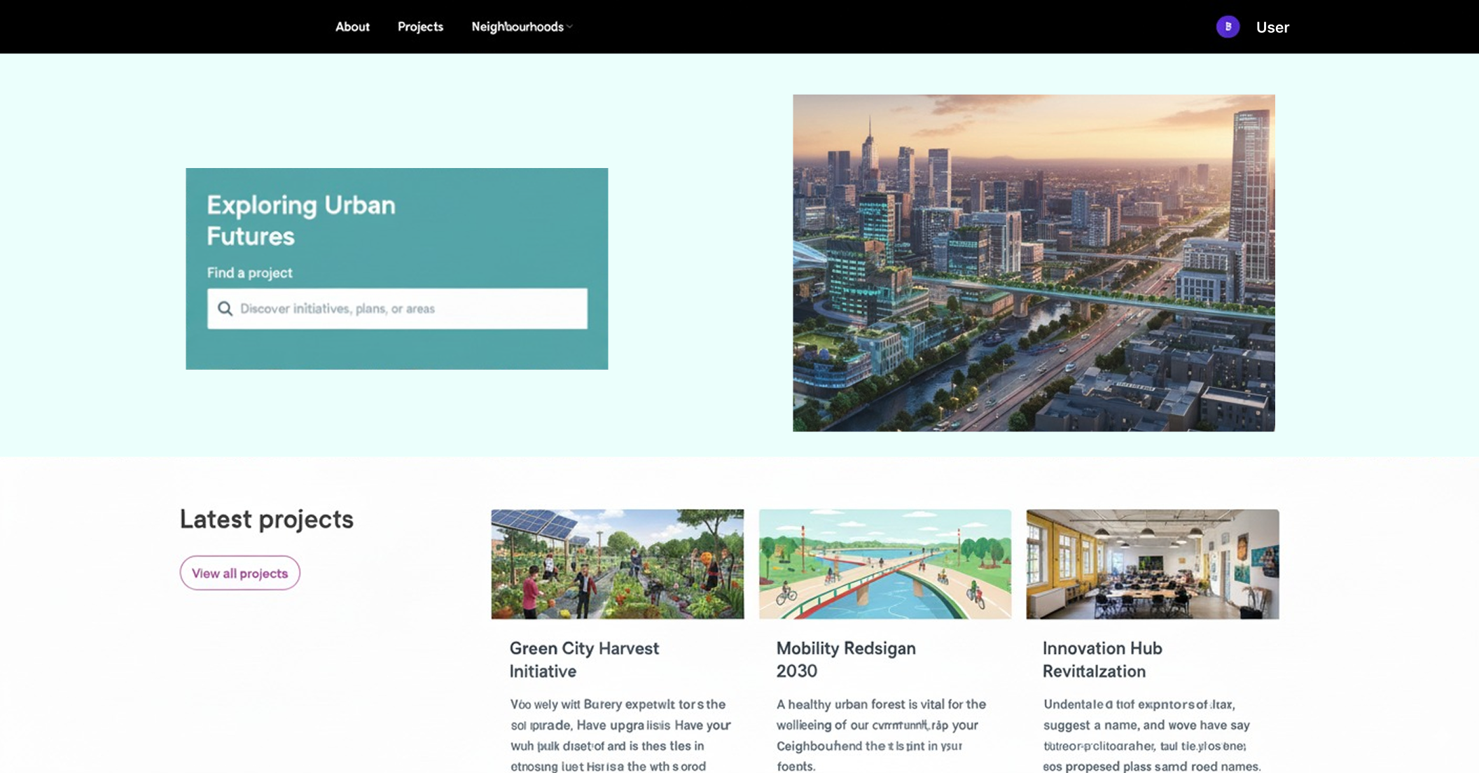
Site Palette
Your site palette defines the core colours used throughout your community platform. District Engage provides multiple preset palette options including Default, Midnight, various blues, greens, reds, purples, and other colour families.

Each palette includes:
- Primary colours: Main brand colours for headings, links, and key interface elements
- Secondary colours: Supporting colours for backgrounds and highlights
- Tertiary colours: Additional accent colours for visual variety
You can preview your site’s complete colour palette by visiting /styleguide/palette on your District Engage site.
Site Style Options
Choose from available style themes:
- Default: Classic District Engage appearance with balanced spacing

- Spacious: Modern, airy design with increased white space, ideal for professional engagement
- Kiwi: Compact layout optimised for content-heavy sites
Navigation Alignment
Position your main navigation menu for desktop devices:
- Left: Traditional left-aligned navigation
- Centre: Centred navigation for balanced presentation
- Right: Right-aligned navigation for unique positioning

Navigation alignment only applies to desktop breakpoints. Mobile devices automatically use responsive hamburger menu layouts.
Typography
Select from over 1,500 Google Fonts or use the default font. Consider readability and accessibility when selecting fonts.
Homepage Configurations
Access homepage-specific settings through Settings > Structure > Home page.
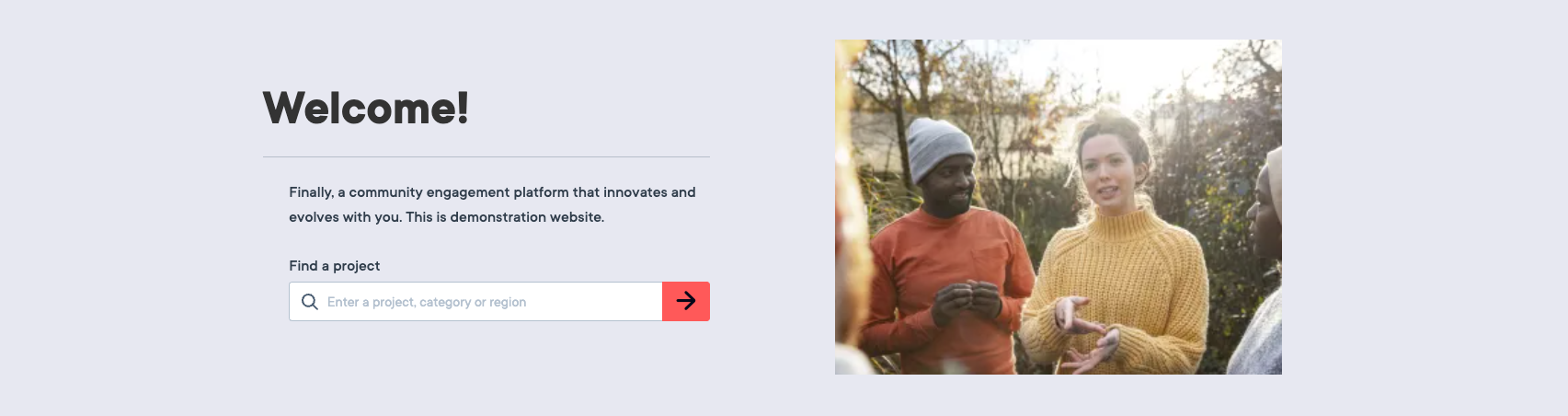
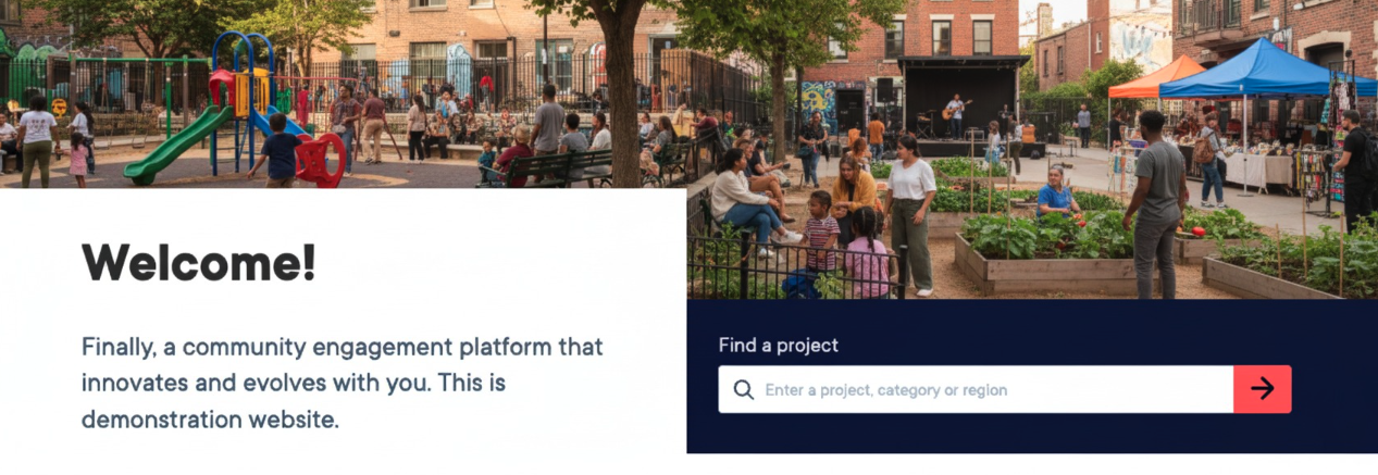
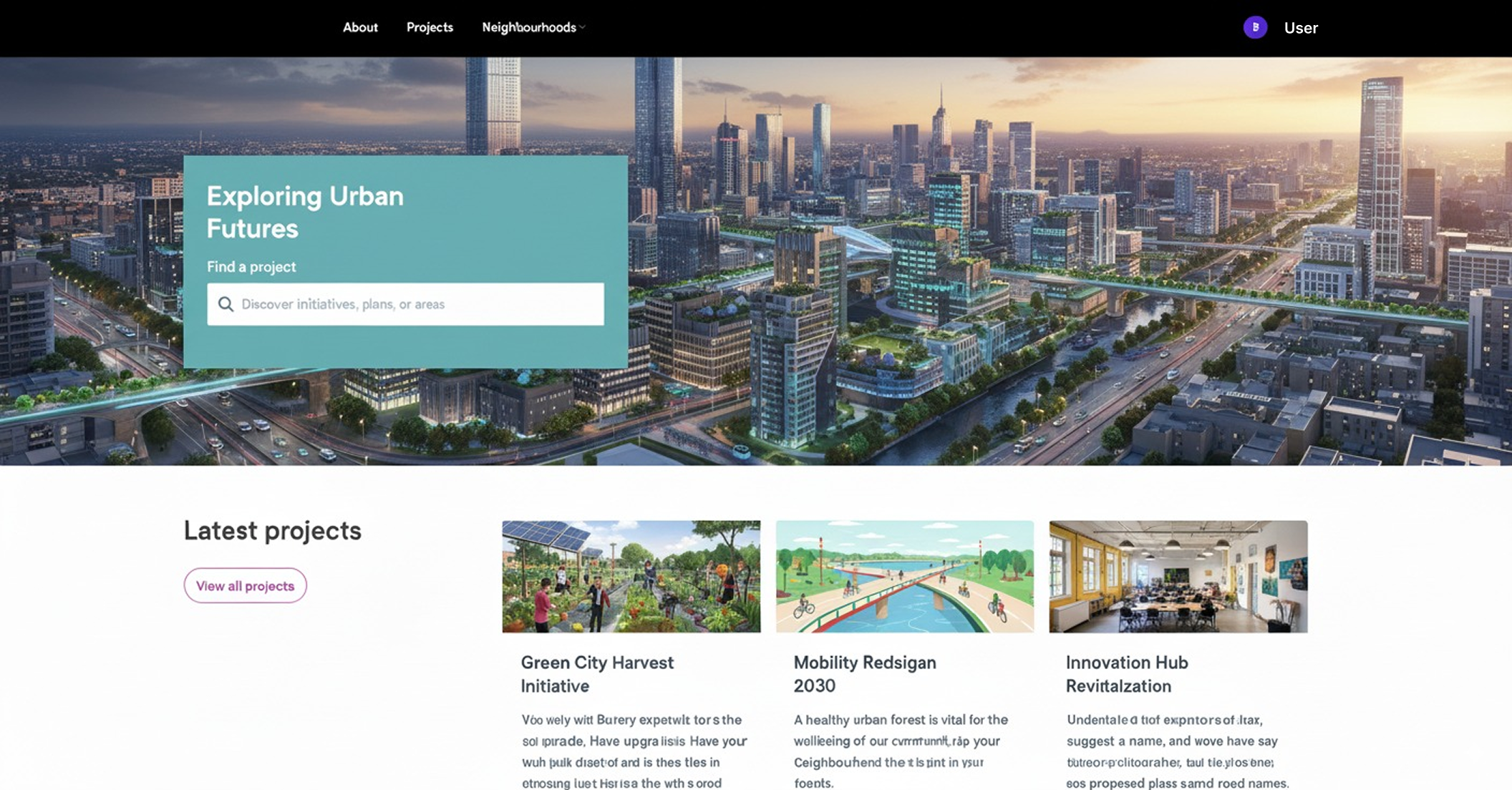
Hero Style Options
Configure how your homepage hero section appears:
- Default: Standard layout with title and description
- Wide image: Full-width image layout for maximum visual impact
Hero Search Form
Toggle the project search functionality within your homepage hero section on or off to match your engagement strategy.
Hero Registration CTA
Enable and configure custom call-to-action text for user registration buttons that appear in the hero section. Buttons automatically hide for logged-in users.
Content Block Styling
Relationship Block Title Positioning
When adding content blocks (project lists, event lists, survey lists):
- Expand Advanced Options for the block
- Select Title Position: Top (default), Left, or Right
- Desktop layouts only; mobile uses top positioning
Content Group Background Colours
For Highlight and Full Width Highlight column groups:
- Select background colours from your site palette (Primary, Secondary, Tertiary)
- Each available in light and dark variants
- Automatic text contrast adjustment ensures accessibility compliance
Header & Footer
Configure your site’s header and footer elements through Settings > Appearance.
Header Elements
Main Logo
- Displayed in header and email templates
- Recommended formats: PNG/SVG
Site Icon
- Displayed as browser favicon
- Recommended format: PNG
- Optimal size: 512x512px square
Footer Elements
Footer Logo
- Separate logo displayed in site footer
- Recommended formats: PNG/SVG
Footer Logo Link
Configure the footer logo to link to your organisation’s main website, creating an integrated experience across your digital properties.
Footer HTML
Advanced Users Only
Footer HTML customisation is reserved for advanced users and should be used with caution. Test changes thoroughly to ensure proper display across devices.
Add custom HTML content to your site footer for additional information, links, or branding elements.
Best Practices
Accessibility
- Maintain sufficient colour contrast (minimum 4.5:1 ratio)
- Choose readable fonts at all sizes
- Provide alt text for all images and logos
- Test keyboard navigation functionality
Performance
- Optimise image file sizes
- Test loading times with custom CSS
- Clear site cache after making changes
Need Additional Help?
If you encounter issues with styling or need assistance with advanced customisation, contact the District Engage Support Team.


